Research for My Digipak
In this post I will discuss the processes that took place in the creation of my digipak, which includes my CD album sleeve, booklet inside the CD case, and the CD itself. I will also analyse a magazine advert that the Arctic Monkeys have released. In my digipak, I plan on creating a brand identity that will differentiate the band I have chosen to other bands in the music industry. For my research I studied and gathered information on two bands that have the same style and genre as my chosen band, and included albums that they have released, and also the entire digipak that was included in that album. I will use these as inspiration for my digipak - I could also take inspiration from iconic album covers over the years, such as the famous album cover from The Beatles in which they walked across a zebra crossing.
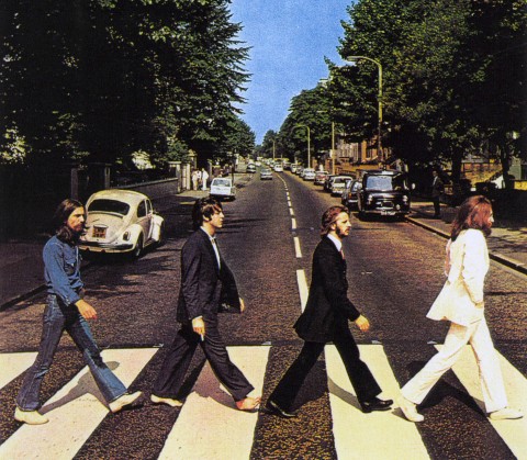 |
| Something as iconic as this could be used as inspiration for my digipak |
Arctic Monkeys
The Arctic Monkeys are an indie-rock band, similar to my chosen band, from Sheffield in the UK. The band consists of four members, Alex Turner, who is the lead singer and guitarist; Jamie Cook, who is also the lead guitarist; Nick O'Malley, who is the bassist and backing vocals and Matt Helders, who is the drummer and does backing vocals. The Arctic Monkeys have released five studio albums, with their debut album, "Whatever People Say I Am, That's What I'm Not", released in 2006. All five of their albums have reached number one in the UK charts, making them one of the most successful bands in British history. Their debut album became the fastest selling debut album in UK history, and currently still holds that record. |
| Arctic Monkeys' Debut Album. They kept the same font throughout the album cover and CD, therefore keeping their brand identity. |
 |
| Album cover for The Vaccines' "Come of Age" |

The Arctic Monkeys have released four albums after the release of their debut album, and their album covers have changed styles. Their second album, "Favourite Worst Nightmare", was released in 2007 to similar commercial success and critical acclaim as their debut. The Arctic Monkeys' style of album cover changed significantly. I believe that they are trying to convey a house party - the songs in the album are very similar to that of the first, so I believe that in terms of musical style they were still the same as they were in their previous album. The reason I believe that is because the setting in which this cartoon-styled picture is taken could be interpreted as student flats. The target audience for Arctic Monkeys songs are around 16+, so the album covers setting in a student flat area makes sense in my opinion.
Other Arctic Monkeys albums include, "Humbug", "Suck it and See" and their most recent release, "AM".
 |
| The third album from Arctic Monkeys "Humbug" |
 |
| The back of the album cover |
The back cover of the album features the same font that is apparent on the front of the album cover, once again conforming to their brand identity. The listings of the songs featured in the album are seen in a plain black font - similar to that of the album name above the band logo. This creates consistency throughout the digipack for the audience. The contents of the back looks like it is written on a piece of paper - this is something I plan on doing in my digipack. The reason for this is because many of the artists plan and write their songs on pieces of paper like this, and it gives off the effect to the audience that they are a band of the Indie genre.
 |
| CD of the Album |
This is the picture that features of the physical CD of the digipak. On the CD, it is important that the bands logo, or at least the name of the album, features on it, as this differentiates themselves from normal CDs. The Arctic Monkeys do this by imprinting their initials, "AM", on what looks like a pie. This unique CD stands out from the rest of them, once again solidifying their brand identity. The reason for the pie image could represent the normality of the band - they aren't like pop stars and enjoy the simple things in life, which is typical of the indie genre.
 |
| The fourth album from Arctic Monkeys, "Suck it and See" |
This is the album artwork for the Arctic Monkeys fourth official album, and fourth consecutive number one, titled "Suck It and See". The band decided to go for a very minimalist approach, with the only things present on the artwork their band name, once again keeping the brand identity, and the name of the album written in capital letters in plain black font. The background colour of the album cover is beige/cream. The reason as to why the Arctic Monkeys have done this might be because they want to give off the impression that they only want to focus on their music, and not the look of the band. This is popular in the Indie-genre, as a minimalist approach is used to differentiate themselves from being placed in the Pop category. Despite the simplistic presentation of the album cover, the band name has to be included on the front as this tells the audience who the album was made by - if they don't do this the audience wouldn't be able to tell who the artist was, due to the fact that they haven't got a lot of information to deduce who made it thanks to the simplicity of it.
 |
| The back of the album cover |
 |
| The inside of the digipak |
This is the contents of the digipack; it features a picture of the entire band, using a long shot. The location that the band are in seems relaxing, and this might be the persona that the Arctic Monkeys are trying to give off to their audience - that they are just four normal guys and do normal things. This picture that features in the digipak could also be used as a small poster for their fans who purchased hard copies of the album.

This is the CD for the album. There only image seen here is the Arctic Monkeys band logo featured on the CD, with the record label Domino at the bottom. This is the same style that is featured on the front and back of the CD cover, solidifying their consistent image of the band.

This is the front album cover of the Arctic Monkeys fifth, and most recent release, "AM". The title of the album doesn't feature on the front of the album, however once again the bands logo is in the top right hand corner, identical to their previous release, "Suck It and See". The main colours that feature are black and white, once again in-keeping with that simplistic approach shown in their previous albums, and also what is shown in the Indie genre generally. The image in the middle is a sound wave, and most probably is the sound wave created from one of their songs - this proves once again that the band are heavily focused on their music rather than their image, which is typical of their genre.
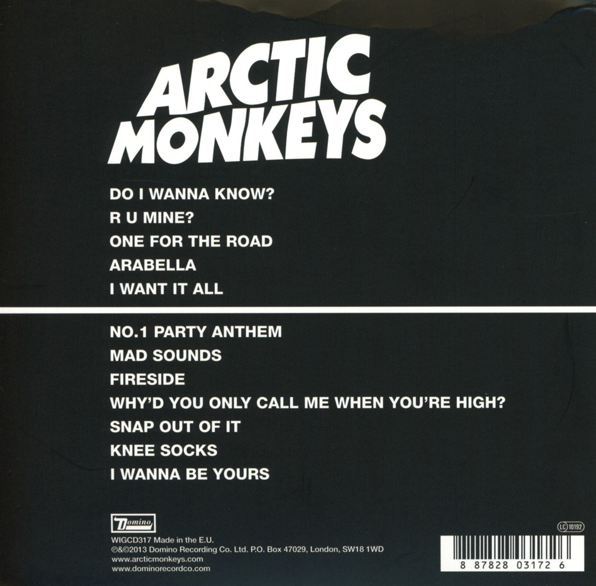
This is what the back of the Arctic Monkeys album cover looks like. The colours and fonts shown are all the same, with the band's logo taking up a third of the back.The name of the songs are written in a white and the same font that is seen in "Suck It and See". There is a thick white line that runs through the middle, which joins with the front cover of the album. The image in its full could be a sound wave in the form of a woman's bra, possibly relating to "nights out", which is a popular topic throughout all the Arctic Monkeys songs. The record label's logo, Domino, is also featured at the bottom of the back, along with other information and the bar-code.

The CD of the "AM" digipak is the same as the front cover of the album, with the white sound wave in front of the black background. This keeps the current image of the band consistent with the rest of the digipak.
For my finished digipak, I could use a simplistic approach similar to the Arctic Monkeys, "AM" and "Suck It and See". However, my band aren't established enough to use that approach when creating a digipak, so I will take inspiration from the Arctic Monkeys in the sense that they were consistent with their brand image, but I will most likely not take inspiration from their simple design of their albums. However, out of all the Arctic Monkeys albums discussed in this post, I am most likely to take inspiration from "Whatever People Say I am, That's What I'm Not" and "Humbug". I am more likely to be inspired by these albums because they conform heavily to the Indie genre, therefore I will be appealing to my chosen bands target audience.
Magazine Adverts/Posters for Arctic Monkeys
 |
| Magazine Adverts for the Arctic Monkeys latest album release, "AM" |
This is the poster that would have been included in the promotional campaign for the Arctic Monkeys fifth studio album, "AM". The poster on the left is a portrait picture of the album's artwork - this makes the audience instantly recognise who the poster is from, as most likely fans have already seen the artwork for "AM". At the top of the poster is the band's name, "Arctic Monkeys", written in their signature white font - this keeps the brand identity of the band, and if the audience didn't recognise the image of the poster, they will certainly recognise the band logo. At the bottom of the poster is the information regarding the album release date - written in white font are the words "NEW ALBUM", telling the audience about their new release; "AM" is a bigger font, alerting the audience to their new album's name; the release date, "09.10.13", informing the audience as to when they can purchase the new album. Also seen at the bottom is the record label of the band, which is Domino. All the information seen at the bottom is imperative to making a successful poster - if this information isn't included, the audience is kept guessing as to what the poster is about, rather than being alerted to a new album from the band. The poster has two colours, with a black background, with the images and text all in white.
The poster on the right, another "AM" promotional poster, is the most likely of the two to be seen in a magazine such as NME. On the poster/magazine advert there is a black and white image of the band's lead guitarist and vocalist Alex Turner, performing one of the band's songs at a venue or concert. This poster is more likely to appeal to the audience, hence why it probably featured in a magazine, because it shows the band performing, and their is a lot more action going on that the poster next to it. The low angle shot of Alex Turner gives the gives the audience a sense that they are there watching them perform, meaning that it could also be a POV shot - the audience are seen in the background looking up at the band and Alex Turner, which backs up my opinion of the shot possibly being point of view. Much like the poster on the left, there is the "Arctic Monkeys" logo above Alex Turner - once again, their logo is their brand identity, and will be included in every marketing campaign that the band are involved in, as their logo is the most recognisable thing to the audience. Seen at the bottom going from left to right is the same information included on the other poster: "NEW ALBUM", "AM" and the release date, "09.10.13". Also at the bottom, in the right hand corner, is the Domino logo which is the record label that they band belong to. All text is seen in white, contrasting against the black and white image in the background.
I think that the poster on the right of the two would be good to use as inspiration for my magazine poster/advert, as it includes the most famous band member, the information surrounding the album release, and the band's logo, being consistent with their brand identity.
The posters for the Arctic Monkeys previous releases can be seen below:


As you can see, all five of the Arctic Monkeys posters promoting their albums are set out in a similar, yet different enough to not be considered the same, style - this conforms to their brand identity, as any poster set out in this way is automatically liked to the Arctic Monkeys posters.
No comments:
Post a Comment