Wednesday, 30 April 2014
Tuesday, 29 April 2014
Evaluation Question 2
How Effective is the Combination of Your Main Product and Your Ancillary Tasks?
Evaluation Question 1
In what ways does your media product use, develop or challenge codes and conventions of real media products?
Monday, 28 April 2014
Final Cut - Music Video
Final Cut for My Music Video
This is the final cut for my music video, "Stuey's Morris Isis" by my chosen band, Not My Day.
If I was to do this again, I would use more locations in my music video to create more variety. However, I am fairly happy with the end result.
When compared to my animatic, there a few differences, but overall I tried to stay true to it. For example, one difference was that in the animatic there were more locations present, such as a long shot of the band in front of a tree. Unfortunately, I wasn't able to get this shot into the final cut of my music video, so if I had the chance to do it again I would definitely include this shot in order to add more variety to my music video. The rest of my final cut I feel stayed true to the animatic, as the feedback I received from my audience liked the animatic that I showed them, so I felt that it would be best for my final product to stay true to the animatic.
Thursday, 17 April 2014
Magazine Advert
Final Magazine Advert

This the magazine advert for my chosen band, "Not My Day". The background image is a collage of the band's instruments, which I thought would conform to the Indie genre, as instruments are part of the main image for bands in this genre. Also, the same instruments are used in the advert and the digipak, creating a brand identity in the process. Other images seen are the band, also seen in the insert for the digipak. This makes sure the audience know what the band members look like, once again conforming to a brand identity. Domino Records and Atlantic Records also feature on the magazine advert, which is typical on all magazine adverts and promotional products for albums, in the top right hand and top left hand corners. They are included to remind the audience which record labels the band belong to. All the images seen throughout the magazine advert conforms to brand identity, as the images are consistent with the digipak for the band.
The text that features on the magazine advert is all written in the band's typical "stencil" font, which is consistent with other fonts seen throughout the marketing campaign (digipak) for the band's new album. The band's logo, "Not My Day", is written in a dark blue stencil font in the middle of the advert, which is typical of the band and the audience would have seen that throughout the digipak - this means that the brand identity has been successfully presented to the audience. The rest of the text seen in the advert is written in a smaller lighter blue - also seen on the digipak. The stencil font creates consistency, whereas the difference in colour adds variety to the advert, as the main colour is dark blue. Situated at the top of the advert is the text "THE DEBUT ALBUM" with the words "OUT NOW" seen just below - this alerts the audience to the availability of the album; if any of the magazine readers see the advert and are interested in the band, they now know that the album is available to buy now. The release date is always seen on the magazine advert, whether it is out now or in the future. Seen below the bands logo are the most popular songs included in the album, "FEATURING THE HITS "STUEY'S MORRIS ISIS" "... - this also gives information to the audience, and that their favourite songs are featured, giving the audience all the more reason to buy the album. Something like this is typically seen in magazine adverts, but is especially seen in adverts for a debut album, as the audience might not be familiar with the band and their songs. Once the artists are fully integrated into the mainstream audience, like Arctic Monkeys, they might not have to include successful songs on the advert in order to promote the album to the audience. Seen at the very bottom of the advert, much like the digipak, is a black border with the album reviews included on the advert - this appeals to the target audience of the band, the magazines that have reviewed the album are typical of the Indie genre. The magazines are also the most likely to have this advert for the band featured in their magazine.
All in all, I feel that this magazine advert conforms to the Indie genre, whilst solidifying the brand identity of the band that was created throughout the digipak.
Wednesday, 16 April 2014
Digipak
Final Digipak
Seen below are the images of my digipak, including previous audience feedback and details on how I changed my digipak in order to make it a better final product. The software I used to edit images for my digipak was Photo Shop.
Front Cover of Album for the Digipak

This is the front cover of my digipak for my chosen band, Not My Day - the album is called "Not My Day", which means that the album is a self titled debut; this is common in all genres, and especially Indie, as it solidifies the band's name to the audience. The medium shot used in the background includes all the band members - I also thought it would appeal to the audience if the location of the album cover was where their first video from the album, my final cut, was shot. I believe this would appeal to the target audience because it would be the place that they recognise the band from, creating a brand identity. The use of the entire band in the debut album cover is important because it introduces the audience to them, creating the brand identity that will be associated with Not My Day with future releases. There was a "vintage" filter - this conforms to the Indie-rock genre, as they believe that they making music that in the future will be classed as vintage. Also seen in the front cover is the logo, "Not My Day". This is situated above the drummer's head, and is written in the band's "stencil" font - this font is seen throughout the front cover of the album, solidifying the brand identity of the band, because if any of the audience saw this particular font in the future, they would link it back to Not My Day. The font colours chosen in the album cover are dark blue, for the band's logo, and light blue, for the other various information on the front. I chose blue as a theme on the album cover because it creates consistency - the band's logo colour will always contrast with other text on the cover as to keep it refreshing, too much of the same colour would bore the audience. Featured at the top and bottom of the cover, in front of a black background, are the album's reviews (top) and singles that the audience may have heard before the album was released (bottom). They are written in the same stencil font that is seen on the band's logo, but in a light blue colour to contrast. The "Rolling Stone" review is featured on many front covers of albums of all genres, and it signifies to the audience the quality of the band's music - including a "Rolling Stone" review on the album cover promotes the band, and therefore attracts audiences from different genres, not just the Indie genre. The bottom of the album cover has "Featuring the Hit Singles Stuey's Morris Isis and Taken Too Much". I thought it was imperative, as it is a debut album, to include singles that were released before the album, just in case the audience didn't know who the band were they would recognise their hit singles. Upon showing the rough cut, the feedback that was given by classmates was that they thought the image itself would look better with a filter, which in my final product, as mentioned earlier, was added. They also felt that the font colour needed to be changed in order to keep the album refreshing, instead of using the same blue throughout. I changed the font colour to a lighter blue for the smaller text, as it kept the brand identity of the band's chosen colour (blue) but also kept things refreshing for the audience. If I could improve one thing about the front cover, I would say the band's logo, "Not My Day" in the centre of the image, isn't as clear to the audience as it could be - if I were do do it again, I would make it bolder so the audience can see it better.
I believe that the front cover of my digipak would create a successful and consistent brand identity for the band, mostly due to the fonts used and the image included in the cover.
Back Cover of Album for the Digipak

This is the back cover of my digipak for my chosen band "Not My Day". The background is a close up shot of a piece of paper, pens and drinks - a band member, the lead singer, looks like he is writing the album's track list on the piece of paper. I liked that idea a lot because it signifies to the audience that even band's have to start brainstorming somewhere, giving the sense of normality, and I feel that the end result of this idea was well executed. Also seen in the background image are drinks of beer - I feel that these props conform to the Indie genre, as many of the artists in this genre present to the audience that they like drinking and having a good time, and the empty glasses show that they have been there a while. In the lead singer's hand is the pen with which he wrote the album's track list, and there is also a black pen seen, which the lead singer wrote the album's specifications, seen at the bottom, with. The image also has a blue vintage filter, which is a similar filter that was seen in my final cut for my music video.
The fonts used in the back cover of my digipak, apart from the specifications, are all seen in the "stencil" font, which is always used in the digipak - this is because it solidifies the brand image of the band, because if the audience see that font elsewhere they will automatically think back to the band Not My Day. However, the font colour changes between dark blue and a light blue colour, like the front of the digipak. The dark blue is always used for the words "Not My Day", as it is the band's logo and the band's logo colour, and it is also used for the track list, as it is displayed bolder against the white paper background; everything else, like reviews for the album, is in a light blue colour because it contrasts with the dark blue, but still keeps the blue image of the the band. At the top and bottom of the back cover are the back boarder that also featured in the front cover - I felt that I had to be consistent, and that is why they feature on the back cover. Also, they contrast the light blue stencil font perfectly, with the words "NME - *****" and "Kerrang! - ****" and "Q - A Breath of Fresh Air - *****" (top of the back cover) featured. All the album reviews featured on the digipak are from magazines that would typically review albums from the Indie-rock genre, therefore conforming to the genre. The words at the bottom, "see more of the band at www.notmyday.co.uk" tells the audience where to go if they want to learn more, or see more about the band, such as tour dates and new releases. In the specification, the band's logo is once again seen in their dark blue stencil font to continue with the brand identity. However, the rest of the album specification is seen in a black "typewriter" font - this particular black font is typical of a large majority of albums, not just the Indie genre, due to the font being easy to read (it needs to be easy to read because the font size for specifications are small). The copy write image is also used for legal reasons. The record labels logo's are located just above the specification - the logos are Domino Records and Atlantic Records; they are included for image and brand identity purposes, because if the audience researches those record labels, they might find other artists that belong to the label, which could in turn make the label generate more revenue.
I am fairly pleased with how the back cover of the digipak turned out, because all the images and fonts were all executed in a way that conforms to the Indie genre and also solidifies the brand identity of the band.
Inside the Digipak (Insert)

This is the insert for my digipak for my chosen band, Not My Day. As you can the see, the insert features the entire band with their instruments, and also acknowledgements from the band. The images of the band members used are the same that featured on the front cover of the digipak - the difference is that all of the background is removed, so you only see an individual cutout of the band members. I did this so the acknowledgements seem more personal to the audience, as the only image you can see are the band members and their faces. The acknowledgements are written in a "handwriting" font, which once again signifies a personal touch from the band to the audience, which shows that they are truly grateful. I feel that the black colour of the font adds professionalism to the acknowledgements. The bands logo, "Not My Day", is seen in the background - once again solidifying their brand identity.
I am fairly happy with the way that the insert for my digipak turned out, as I believe it creates a personal touch from the band to the audience and also keeps the brand identity of the band consistent.
CD Print for My Digipak

This is the CD print for my digipak. For this, I decided to keep things simple, as the CD print is used the majority of the time just to tell the audience the name of the album. I used a black CD template, as I felt it would make the images on the template stand out even more to the audience. The images used were the instruments the band uses - this reminds the audience what genre of band they are listening to, and also in a sense creates brand identity, as the same instruments are pictured throughout the digipak. The instruments are presented to the audience with a blurry effect, and I felt that this keeps things refreshing for the audience, and that brand identity for the instruments was created effectively enough so the audience know which instruments they are and the band member they belong to. The band's logo is once again situated in the top-middle of the template - as it is the band's debut album, I felt it was imperative to include the band's logo at every opportunity, without over doing it, in order to cement brand identity for the band. I feel that I have created brand identity successfully throughout my digipak, as I have included the band's logo on every part - the front and back cover, the insert, and now the CD print. This sets the band up for their future albums, as a brand identity has been created in their debut, their band logo won't have to be used as much because the audience know who they are. Also seen in the CD print are the specifications, written in the same font seen on the back cover, except the font is white in this case to make it visible against the black background. There is a copyright image seen, indicating to the audience that "Not My Day" are now a brand, and can't be copied by anyone. The record labels, Domino Records and Atlantic Records, also have their logos featured on the CD print - this is common in every genre, not just Indie, as it proves as more advertisement for the record labels.
That is my digipak - I feel that throughout it all I created brand identity successfully through the use of the band's logo, and that I also conformed to the Indie genre through the images that featured on the digipak.
Tuesday, 15 April 2014
Rough Cut for My Magazine Advert, Including Audience Feedback
Magazine Advert - Rough Cut

This is the rough cut for my magazine advert. Located in the middle of the advert, is the band's logo, seen throughout the digipak, once again cementing that brand identity. As it is a debut effort for the band, it is important that the band's logo and colours are included as much as possible, so the audience familiarise themselves with them. Underneath the logo, are the record label's logos, Domino Records and Atlantic Records - logos of the record labels are commonly seen on magazine adverts, in all genres, as they remind the audience that the band belong to someone, this in turn promotes the label. Above the band's logo, in a light blue stencil font, is the text "The Debut Album" - this informs the reader that the band are advertising an album, which is an important part of a magazine advert. Images of the band, similar to those seen in the insert for the digipak, are used with a blue filter to emphasise the look of the band and the band's colours. Seen at the bottom, in front of a black border, are reviews for the album - the text is still the band's recognisable stencil font, but this time in a light blue to contrast the black border and keep the text fresh. The background of the magazine advert is a collage of the band's instruments - I thought this was a good idea because it is unique, and is not likely to be seen for a debut magazine advert, therefore challenging the conventions of the stereotypical indie genre advert.
The audience feedback I most received for this was that it needed more information concerning the band's album - a suggestion was that I included some of the most popular songs that would feature on the album. Another suggestion concerning information was that I informed the audience that the debut album is "Out Now", so they know that it is available to buy - this is seen in many magazine adverts. Another suggestion was that the record label's logos were moved into the corners.
The audience feedback I most received for this was that it needed more information concerning the band's album - a suggestion was that I included some of the most popular songs that would feature on the album. Another suggestion concerning information was that I informed the audience that the debut album is "Out Now", so they know that it is available to buy - this is seen in many magazine adverts. Another suggestion was that the record label's logos were moved into the corners.
Rough Cut for My Digipak, Including Audience Feedback
Digipak Rough Cut
Digipak - Front Cover (Rough Cut)

This is the rough cut for the front cover of my digipak. The band's logo "Not My Day" is situated at the top-middle of the cover, in a blue stencil font - this creates a brand identity for the band that will be seen throughout the rest of the digipak. Cementing a consistent band logo is important as it allows the audience to establish who the band are and what the logo looks like. The background image is the band performing in the same garage that is seen in the music video for "Stuey's Morris Isis", which is my chosen song. I believed that this would also create a brand identity, as this location is something that the audience are most likely to recognise the band from. Seen in the middle of the front cover is information that might interest the audience, "Featuring the Hit Singles Stuey's Morris Isis and Taken Too Much" - the reason as to why this information might interest the audience is because those were the most popular songs released before the full release of the album, and they are the songs that the audience are more likely to know.
The audience feedback I received for the front cover in order to improve it was that the text needed to be cleared in the middle of the album front cover - it was too hard to read, so perhaps putting it against a black border at the bottom would attract the audience to the information more. Another bit of audience feedback I received was that the filter on the image needed to be slightly darker, in order to make the rest of the digipak front cover stand out. One final bit of audience feedback I should implement into my final cut of my digipak is that there needed to be a little bit more information to fill the space at the top of the digipak. In my final cut, I will include a black border, with text above it. The text might include reviews for the album, or more information concerning the songs featured on the album.
Digipak - Back Cover (Rough Cut)

This is the rough cut for the back cover for my digipak. The album track list is seen in the middle of the back cover, in the band's blue stencil font - this keeps consistent with the brand identity I tried to introduce on the front cover. The image seen in the background tries to signify the process in which artists are writing down their songs, and I feel that I did that particularly well, as the mise-en-scene gives the impression of an Indie band I was trying to make - the audience liked the image on the back of the digipak also. Also seen on the back are the specifications of the album in a black typewriter font, "all rights reserved..." refers to the band and record labels, who's images you can see above the specifications. Domino Records and Atlantic Records have been record labels for many bands and artists, such as the Arctic Monkeys, so I thought I should include someone of their stature as the band's record labels.
The audience feedback I received in order to make the back cover of my digipak better included that there was no connection, or similarity in layout, with the front cover of my digipak. The only connection visible to the audience was the band's logo and stencil font, but there needed to be more - in order to implement this particular piece of feedback, I will include black borders on the bottom and top, to match that of the front cover. The audience also wanted to see more of a variety in colours, which I will include by changing the reviews from their blue stencil font to a light blue stencil font, which will also be consistent with the brand identity I am trying to create.
Digipak - Insert (Rough Cut)

This is the insert for my digipak. This is the part of the digipak where the band can thank their audience for supporting them, something which is common in all genres, not just specifically the indie genre. The "thank yous" are situated at the top-centre of the insert, so it is obvious to the audience. This is seen in a black "handwriting" font - I felt that this particular font created a personal feel from the band to the audience, taking a break from cementing the brand identity. The images seen in the insert are cut-outs of the band, with an added blue filter, in order to match the band's colour. I felt that, against a white background, this would make the audience once again feel as though the band are directly speaking to them, as the only things visible in the insert is the thank you note and the band.
The feedback I received in order to make my insert better was that there needed to be more variety - the audience felt that the insert was too bland, and that there needed to more images or text in order to make the audience take notice. The audience also said that the cut-outs of the band looked rough, and needed to be smoothed out in order for it to look more professional. Another thing that the audience noted was that the band's logo didn't feature in the insert. I will try and implement this feedback into my final cut in order to make the digipak look more professional.
Digipak - CD Print (Rough Cut)

This is the rough cut of my CD print for my digipak. Seen at the top-centre of the print is the band's logo in the familiar blue stencil font, with the specification "all rights reserved" in a white typewriter font below the logo - in the final part of the digipak the audience see, hopefully the brand identity of Not My Day is cemented in the audiences mind. Other images that are seen in the print are black cut outs of the instruments that the band use, each in the position the band member is usually seen in - thought this would be a good idea because instruments are an important part of the band, and I thought the images seen are quite unique, therefore challenging the conventions of stereotypical Indie genre products.
During the feedback, the audience felt that there needed to be more images on the print - one suggestion was that the record label should be included on there to form part of the specifications, and also to remind the audience who the band belong to. Another part of feedback from the audience was that the black cut-outs of the instruments didn't work as well as it could have done, and that it would be better to include actual images of the instruments in order to create brand identity, as the instruments used in by the band are unique to them.
For my final cut of my digipak, I will try to implement the audience feedback to the best of my ability, as each suggestion could help me to make a better final product.
Monday, 14 April 2014
Ideas and Planning for My Digipak and Magazine Advert
Ideas and Planning

This is the back cover of Plan B's debut album, "Who Needs Actions When You Got Words". The genre of his music doesn't fit with my Indie genre, however I like the idea of the image shown on the back of this album cover. Plan B is seen writing the track list of his album on a piece of paper, seen in a close up camera shot. The reason that I like this is because it gives the audience a sense of normality, and that anyone can pick up a piece of paper and start writing songs, therefore I believe that this also appeals to the Indie target audience. The rest of the image, such as the alcohol, lighting and blood on his hands, conforms to Plan B's musical genre of urban hip hop. If I chose to do something similar to this digipak, I shall make sure that the mise-en-scene reflects that of the Indie genre, and therefore the genre of my chosen band.

This is the front cover of an album titled "Under the Iron Sea", by the British band Keane. The reason as to why I like this album cover is because it looks unique - the image seen on the cover is striking, and also has relevance to the title of the album, meaning that the image has more appeal to the audience. The colour scheme stays consistent throughout, with different shades of blue seen on the front cover. Unfortunately, I cannot produce an original image of this quality for my digipak, as I don't have the tools available. However, I do like the idea of linking the album title, in my case the self-titled debut album "Not My Day", with the image on the front cover.

This is the album cover for American band Linkin Park's third studio album, "Minutes to Midnight" released in 2007. I like this album cover because there are minimal colours, and it also includes the logo (brand identity) of the band as the most prominent thing in the album cover. It also includes all of the band members, which is once again typical of the Indie-rock genre. Also included in the digipak was close up pictures of the band members, as well as the band's "Linkin Park" logo printed on the CD - I think I will include my chosen band's logo for the print on my CD, as the logo is unique and creates and solidifies brand identity. Included in the booklet for "Minutes to Midnight" are the lyrics for all the songs included in the album, this is something that I could possibly do for my album booklet.


For my digipak, I have come to the conclusion that the booklet, or whatever is included inside the digipak (not the CD), should include some picture or pictures of the band, either when they are practicing their songs or individually. To do this would be conforming to the Indie-rock genre, as many other artists of the same genre as my chosen band have done this with their digipak; it would also appeal to my target audience. For my final digipak, I feel that I should have a shot of all the band on the album cover - due to it being my chosen band's debut album, it is imperative that the audience is introduced to the entire band. I also feel that the shot of the album cover should include the location the band filmed the majority of their first video, in my case my final cut of "Stuey's Morris Isis", as this is where the audience would recognise the most. I believe that this would create a brand identity for the band, and make them instantly recognisable in the future. This would be coupled with the band's logo.
Magazine Adverts:
This is the magazine advert for British singer Ed Sheeran's debut album "+". I like the style of this advert due to the simple layout we can see - there aren't a lot of images, colours or fonts on show, but the organisation of everything grabs the readers attention. At the top of the advert we see the name of the artist, "Ed Sheeran" in a white font, with an image of a paw print to the right of the text. For obvious reasons, this is included to tell the audience who the magazine advert is about. The image seen in the middle is the album cover for the album "+" being advertised - the reason for this is because the artist is promoting the album, and wants to alert the audience as to what the album looks like. At the bottom of the magazine advert, in the same white font used at the top, is the important information that the audience need to know so they can purchase the album - this is imperative for the magazine advert to work, as the whole purpose is to inform the audience of the availability of the album. This information doesn't necessarily need to be presented this way, but some info about the album must be included on the magazine advert.
I like this magazine advert by the Kings of Leon, who are part of my chosen genre, due to the unique nature of the image seen in the middle of the advert. This unique image immediately grabs the readers attention, which is one of the main purposes of the magazine advert. The band's name is featured on the top of the magazine advert, in a white, sort of futuristic font. This font also appears throughout the magazine advert, and is most apparent at the bottom of the advert, where the advert includes the name of the album being advertised, "Only By The Night", with the names of the popular songs below, and in red font the statement that the album is "Out Now". Something like this would be good to include in my magazine advert, as I particularly like the layout of the information seen on the advert.
This is a magazine advert for Coldplay's album "Viva La Vida". This includes the band's name on the top of the advert in a standard white font, with the rest of the text seen on the advert in the same white font, just a smaller size. The name of the album is located below the band's name, with "The New Album" situated below the album name - this informs the audience that the reason that Coldplay are advertising is because they have released a new album. An image of the entire band is seen in the middle of the advert, with the lead singer Chris Martin most prominent - this is due to the fact that he is the lead singer, and is most likely to be recognised by new audiences. At the bottom of the poster is the info that might attract audiences to the new album. "Violet Hill", "Viva La Vida" and "Lost" are the most popular songs released prior to the release of the full album, and because the audience are most likely to like those songs due to their popularity, they might purchase the album.
The image is incredibly important in the advert for the album, as this is what the audience are looking at. In my research into Arctic Monkeys album advert, they always included something relevant to the album cover, or they included a single image of the band/band member, but just enough to continue with brand identity. In my final magazine advert, I will include an image that is relevant to the digipak and the band, because the digipak contents of the digipak is what the band are trying to sell to the audience through this magazine advert.
Creating My Digipak and Magazine Advert
During the construction stage of my rough cut and final versions of my digipak, I plan on using a software called Photoshop, which I believe will enable me to create effective pieces to conform to the Indie genre, through images and text for example.
This particular tool will enable be to cut round an image and separate it from everything, allowing me to copy the cut-out image and paste it onto another image. This could be very useful for my digipak and magazine advert, as I may want the band against a different backdrop in different parts of the digipak and magazine advert.
This tool on Photoshop will allow me to put text onto images. This will certainly be used throughout the digipak and magazine advert, as information such as "Not My Day" and "Featuring Stuey's Morris Isis" needs to be included. The tool will also allow me to choose what font and colour of font I want to use, and in this case I will select the "stencil" font, as that is the brand identity I want to create throughout my digipak and magazine advert.
There are many other tools on Photoshop, such as changing the filter of the image, that I believe will enable me to complete work of a near industry standard in my digipak and magazine advert.
Monday, 7 April 2014
Research for My Digipak - The Killers
Research For My Digipak
In my digipak I plan to include elements of the Indie genre that will conform and also appeal to my target audience - for example, many album covers and digipaks in the Indie genre are kept simple; this gives off the impression that the band is focused on the quality of music, and wants the audience to focus on the music too. Like I mentioned in another blog, using an iconic album cover style from a previous band as inspiration can also work in your favour, as the audience is automatically attracted to your digipak. Pink Floyd's "The Dark Side of the Moon" album artwork is considered one of the greatest of all time, so this simple approach could be used as inspiration for my digipak. However, this could backfire - the audience could feel that you are trying to imitate a successful band, rather than creating your own band image and identity.
 |
| Pink Floyd's iconic album artwork for their album, "The Dark Side of the Moon" |
For my digipak research, I have chosen to look at some digipaks that the famous Indie-rock band The Killers have released. I have chosen to research this particular band because they are very successful, creating a recognisable band image and identity, and also because they are in the same genre as my chosen band, so I could take inspiration from some of their digipaks.
The Killers
The Killers are an Indie-rock band formed in Las Vegas, 2001 by Brandon Flowers (Lead vocalist and keyboard) and Dave Keuning (backing vocals and guitar). Mark Stoermer (bass and backing vocals) and Ronnie Vannucci Jr. (drums, percussion and backing vocals) would join in 2002, forming the current lineup of the popular band. They have released four albums, "Hot Fuss" in 2004, "Sam's Town" in 2006, "Day & Age" in 2008, and most recently "Battle Born" in 2012.
 |
| Front Cover of "Hot Fuss", The Killers debut album |
 |
| Back Cover of "Hot Fuss" |
The back of album cover is in keeping with the front - the background of the blue sky, and the fonts and colour scheme also seen on the front. The song listing of the album is in a small white font in the top left hand corner. The reason as to why it is so small could be that the band are hinting to many more songs released from the band in the future, therefore leaving the audience wanting more. Seen at the bottom of the back cover is the specifications of the album, such as recording studios and the record label's details - these are always written in a small font, as the audience are not particularly interested in them, but they have to be included for lawful reasons. There is a white version of the logo that The Killers belong to, Lizard King/Vertigo Island, on the left of that writing - any of the audience would instantly recognise the record label that the band belong to. This is all part of The Killers creating a band identity, which is especially important when releasing their debut album, as the band carry on the brand identity created when releasing "Hot Fuss" onto their further releases in the future.
 |
| Front Cover for The Killer's second album, "Sam's Town" |
The most prominent thing on the front cover of "Sam's Town" is once again the band name - the font and size is exactly the same as their previous release "Hot Fuss", albeit in a different colour, therefore The Killers are being consistent with their brand identity. Once again, the name of the album is placed below "The Killers", but this time it is a different font and font colour - the name of the album doesn't have to be as consistent as the band logo. This is because the band's name always stays the same, whereas the albums always differ. Also on the front cover of the album is a picture of a mountain goat, a woman with a banner titled "miss" around her, and what looks like a worn down trailer behind them, all presented through a long shot. The woman may be "Sam", the person that The Killers have named the album after - these pictures in the front cover give the audience an idea of why the band called the album "Sam's Town".
 |
| Back Cover of "Sam's Town", released in 2006 |
This is the back cover, and the audience can see a black and white filter, also apparent on the front of the album, medium-shot of the entire band. The reason as to why the band are shot this, which is very similar to the images seen on the front of the album cover, is because it conveys to the audience that The Killers are part of "Sam's Town". Seen at the bottom of the cover is the song listings - these are displayed to us in small red and white fonts, with the red colour similar to that shown to display the name "Sam's Town" on the front cover. Below the song listings are the usual specifications of the albums, along with the record label's logo in white. Everything seen in this album cover conforms to the Indie-rock genre my chosen band is in, and I could use similar ideas in my digipak.

Seen here is the CD for The Killers sophomore album, "Sam's Town". The image on the CD is a black and white, keeping consistency with the rest of the digipak, close up shot of a mountain goat, which could be the one seen on the front cover of the album. Further specifications are seen around the CD, written in white font - it could be written in white font because the audience aren't interested in the specifications, but they have to be included for lawful reasons. The white font blends into the black and white background, therefore making it hard to read.
 |
| Front Cover of the album "Day & Age" |
This is the front cover of the album "Day & Age", the third album from The Killers, released in 2008. In this album, The Killers moved away from their Indie-rock roots and explored the Dance-rock genre. This change in style can be seen from the colours used on the front cover - they are vibrant colours of purple, blue and yellow, which represent those shown from dance artists. When comparing the colours used in this album cover with those in previous releases, you straight away get the feeling that the band are attempting to change their style. I say this because in their previous two albums, The Killers used grungy colours that would represent the Indie genre, and vibrant colours like purple wouldn't be seen. However, the layout of the front cover has been kept the same in this album as it was in the previous two - "The Killers" band logo is once again situated in the centre, in a shade of purple (which proves the change in musical style, as this colour wouldn't usually be seen in Indie digipaks), with the same of the album, "Day & Age" in a smaller white font underneath it. Even with the change in musical styles, it is imperative that The Killers don't change their band identity - their logo is instantly recognisable to their fans and audiences alike, all through the consistent brand identity created in their earlier albums.
 |
| Back Cover for the album "Day & Age" |
 |
| CD Print for "Day & Age", released in 2008 |
This is the CD of the digipak from The Killers third studio album, "Day & Age". The print of the CD is that shown on the front and back cover of the album art, which was a mosaic pattern in different shades of blue and purple, to represent their change in musical style. This is apparent on the CD and, much like their previous release "Sam's Town", is in keeping with the theme of the digipak. This CD print goes with the rest of the digipak, making the audience recognise who the CD belongs to, and what album the CD is from. The light purple and blue mosaic is printed on top of a black background, which makes the colours even more prominent. Seen going around the rim are the specifications, similar to those seen on the back of the album cover. They are written in a very small white font, almost unreadable, and support the Island Records logo. For my digipak I will include a print on the CD that is relevant with the rest of the digipak, as demonstrated by The Killers in "Hot Fuss", "Sam's Town" and "Day & Age".
 |
| The Killers most recent release, "Battle Born" |
After a four year hiatus, since their change in musical style in 2008's release "Day & Age", The Killers returned in 2012 with their most recent and fourth studio album, "Battle Born". "The Killers" famous logo, like all their other releases, is the most prominent thing on the album cover, as it is centered in the middle of the cover - even after four years without an album, The Killers still keep their brand identity with the styling of their logo on this album. "Battle Born", the name of the album, is once again located directly underneath the band's logo. "Battle Born" is stylised in a bold, black font - the "e" in Battle Born is presented a lightening bolt; this could signify the return to the band's Indie-rock roots, as the delivery of the album title on the front cover is striking. Image shown further solidifies the claim that The Killers are returning to their Indie-rock roots demonstrated in their first two albums. There is a long shot of a highway, with a car looking like it is going head-first into a horse - the horse could be a metaphor for The Killers, and could signify that they are ready for anything that comes their way, hence the relevance of the title "Battle Born". The dull setting of the picture could possibly signify the dark road that the band went on during their hiatus, but now they are ready for anything.
 |
| Back of the album cover |
Seen on the back of the album cover is the track list of "Battle Born". The songs listed are seen in red, but in the same font that was used on the front cover for the album title - as you can see, The Killers have done this with every studio album they have released, therefore being consistent and in keeping with their brand identity as a band. The image seen behind the track list is set in the same area that the image on the front was set in. At the bottom of the back of the album cover are the specifications, with the record label's, Island Records, logo all in red. In my digipak, I should use the same font for my track list on the back and my album title on the front, in order to keep a consistent brand identity - this is especially important with a debut album, as it sets the standards for later albums.
 |
| CD Print for The Killers album, "Battle Born" |
I have learnt that, in order to keep brand identity consistent, I must include relevant pictures in my digipak - an example of this is the CD image of "Sam's Town", as the goat seen on the CD print also appears on the front of the album cover. Also, I will use the same fonts apparent on the front of my album cover to present my track list on the back. I believe that if I include these things in my digipak, I will create a consistent brand identity for my chosen band.
Monday, 31 March 2014
Research for My Digipak and Magazine Advert - Arctic Monkeys
Research for My Digipak
In this post I will discuss the processes that took place in the creation of my digipak, which includes my CD album sleeve, booklet inside the CD case, and the CD itself. I will also analyse a magazine advert that the Arctic Monkeys have released. In my digipak, I plan on creating a brand identity that will differentiate the band I have chosen to other bands in the music industry. For my research I studied and gathered information on two bands that have the same style and genre as my chosen band, and included albums that they have released, and also the entire digipak that was included in that album. I will use these as inspiration for my digipak - I could also take inspiration from iconic album covers over the years, such as the famous album cover from The Beatles in which they walked across a zebra crossing.
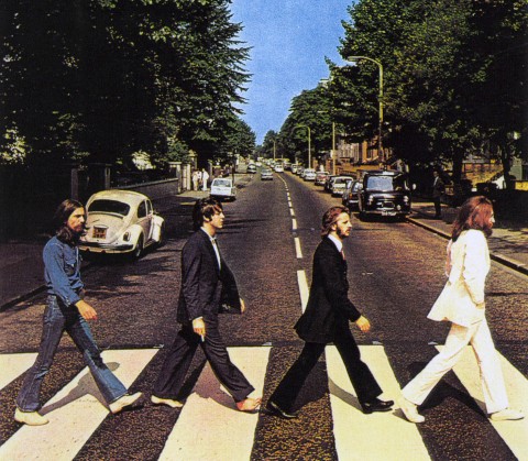 |
| Something as iconic as this could be used as inspiration for my digipak |
Arctic Monkeys
The Arctic Monkeys are an indie-rock band, similar to my chosen band, from Sheffield in the UK. The band consists of four members, Alex Turner, who is the lead singer and guitarist; Jamie Cook, who is also the lead guitarist; Nick O'Malley, who is the bassist and backing vocals and Matt Helders, who is the drummer and does backing vocals. The Arctic Monkeys have released five studio albums, with their debut album, "Whatever People Say I Am, That's What I'm Not", released in 2006. All five of their albums have reached number one in the UK charts, making them one of the most successful bands in British history. Their debut album became the fastest selling debut album in UK history, and currently still holds that record. |
| Arctic Monkeys' Debut Album. They kept the same font throughout the album cover and CD, therefore keeping their brand identity. |
 |
| Album cover for The Vaccines' "Come of Age" |

The Arctic Monkeys have released four albums after the release of their debut album, and their album covers have changed styles. Their second album, "Favourite Worst Nightmare", was released in 2007 to similar commercial success and critical acclaim as their debut. The Arctic Monkeys' style of album cover changed significantly. I believe that they are trying to convey a house party - the songs in the album are very similar to that of the first, so I believe that in terms of musical style they were still the same as they were in their previous album. The reason I believe that is because the setting in which this cartoon-styled picture is taken could be interpreted as student flats. The target audience for Arctic Monkeys songs are around 16+, so the album covers setting in a student flat area makes sense in my opinion.
Other Arctic Monkeys albums include, "Humbug", "Suck it and See" and their most recent release, "AM".
 |
| The third album from Arctic Monkeys "Humbug" |
 |
| The back of the album cover |
The back cover of the album features the same font that is apparent on the front of the album cover, once again conforming to their brand identity. The listings of the songs featured in the album are seen in a plain black font - similar to that of the album name above the band logo. This creates consistency throughout the digipack for the audience. The contents of the back looks like it is written on a piece of paper - this is something I plan on doing in my digipack. The reason for this is because many of the artists plan and write their songs on pieces of paper like this, and it gives off the effect to the audience that they are a band of the Indie genre.
 |
| CD of the Album |
This is the picture that features of the physical CD of the digipak. On the CD, it is important that the bands logo, or at least the name of the album, features on it, as this differentiates themselves from normal CDs. The Arctic Monkeys do this by imprinting their initials, "AM", on what looks like a pie. This unique CD stands out from the rest of them, once again solidifying their brand identity. The reason for the pie image could represent the normality of the band - they aren't like pop stars and enjoy the simple things in life, which is typical of the indie genre.
 |
| The fourth album from Arctic Monkeys, "Suck it and See" |
This is the album artwork for the Arctic Monkeys fourth official album, and fourth consecutive number one, titled "Suck It and See". The band decided to go for a very minimalist approach, with the only things present on the artwork their band name, once again keeping the brand identity, and the name of the album written in capital letters in plain black font. The background colour of the album cover is beige/cream. The reason as to why the Arctic Monkeys have done this might be because they want to give off the impression that they only want to focus on their music, and not the look of the band. This is popular in the Indie-genre, as a minimalist approach is used to differentiate themselves from being placed in the Pop category. Despite the simplistic presentation of the album cover, the band name has to be included on the front as this tells the audience who the album was made by - if they don't do this the audience wouldn't be able to tell who the artist was, due to the fact that they haven't got a lot of information to deduce who made it thanks to the simplicity of it.
 |
| The back of the album cover |
 |
| The inside of the digipak |
This is the contents of the digipack; it features a picture of the entire band, using a long shot. The location that the band are in seems relaxing, and this might be the persona that the Arctic Monkeys are trying to give off to their audience - that they are just four normal guys and do normal things. This picture that features in the digipak could also be used as a small poster for their fans who purchased hard copies of the album.

This is the CD for the album. There only image seen here is the Arctic Monkeys band logo featured on the CD, with the record label Domino at the bottom. This is the same style that is featured on the front and back of the CD cover, solidifying their consistent image of the band.

This is the front album cover of the Arctic Monkeys fifth, and most recent release, "AM". The title of the album doesn't feature on the front of the album, however once again the bands logo is in the top right hand corner, identical to their previous release, "Suck It and See". The main colours that feature are black and white, once again in-keeping with that simplistic approach shown in their previous albums, and also what is shown in the Indie genre generally. The image in the middle is a sound wave, and most probably is the sound wave created from one of their songs - this proves once again that the band are heavily focused on their music rather than their image, which is typical of their genre.
This is what the back of the Arctic Monkeys album cover looks like. The colours and fonts shown are all the same, with the band's logo taking up a third of the back.The name of the songs are written in a white and the same font that is seen in "Suck It and See". There is a thick white line that runs through the middle, which joins with the front cover of the album. The image in its full could be a sound wave in the form of a woman's bra, possibly relating to "nights out", which is a popular topic throughout all the Arctic Monkeys songs. The record label's logo, Domino, is also featured at the bottom of the back, along with other information and the bar-code.

The CD of the "AM" digipak is the same as the front cover of the album, with the white sound wave in front of the black background. This keeps the current image of the band consistent with the rest of the digipak.
For my finished digipak, I could use a simplistic approach similar to the Arctic Monkeys, "AM" and "Suck It and See". However, my band aren't established enough to use that approach when creating a digipak, so I will take inspiration from the Arctic Monkeys in the sense that they were consistent with their brand image, but I will most likely not take inspiration from their simple design of their albums. However, out of all the Arctic Monkeys albums discussed in this post, I am most likely to take inspiration from "Whatever People Say I am, That's What I'm Not" and "Humbug". I am more likely to be inspired by these albums because they conform heavily to the Indie genre, therefore I will be appealing to my chosen bands target audience.
Magazine Adverts/Posters for Arctic Monkeys
 |
| Magazine Adverts for the Arctic Monkeys latest album release, "AM" |
This is the poster that would have been included in the promotional campaign for the Arctic Monkeys fifth studio album, "AM". The poster on the left is a portrait picture of the album's artwork - this makes the audience instantly recognise who the poster is from, as most likely fans have already seen the artwork for "AM". At the top of the poster is the band's name, "Arctic Monkeys", written in their signature white font - this keeps the brand identity of the band, and if the audience didn't recognise the image of the poster, they will certainly recognise the band logo. At the bottom of the poster is the information regarding the album release date - written in white font are the words "NEW ALBUM", telling the audience about their new release; "AM" is a bigger font, alerting the audience to their new album's name; the release date, "09.10.13", informing the audience as to when they can purchase the new album. Also seen at the bottom is the record label of the band, which is Domino. All the information seen at the bottom is imperative to making a successful poster - if this information isn't included, the audience is kept guessing as to what the poster is about, rather than being alerted to a new album from the band. The poster has two colours, with a black background, with the images and text all in white.
The poster on the right, another "AM" promotional poster, is the most likely of the two to be seen in a magazine such as NME. On the poster/magazine advert there is a black and white image of the band's lead guitarist and vocalist Alex Turner, performing one of the band's songs at a venue or concert. This poster is more likely to appeal to the audience, hence why it probably featured in a magazine, because it shows the band performing, and their is a lot more action going on that the poster next to it. The low angle shot of Alex Turner gives the gives the audience a sense that they are there watching them perform, meaning that it could also be a POV shot - the audience are seen in the background looking up at the band and Alex Turner, which backs up my opinion of the shot possibly being point of view. Much like the poster on the left, there is the "Arctic Monkeys" logo above Alex Turner - once again, their logo is their brand identity, and will be included in every marketing campaign that the band are involved in, as their logo is the most recognisable thing to the audience. Seen at the bottom going from left to right is the same information included on the other poster: "NEW ALBUM", "AM" and the release date, "09.10.13". Also at the bottom, in the right hand corner, is the Domino logo which is the record label that they band belong to. All text is seen in white, contrasting against the black and white image in the background.
I think that the poster on the right of the two would be good to use as inspiration for my magazine poster/advert, as it includes the most famous band member, the information surrounding the album release, and the band's logo, being consistent with their brand identity.
The posters for the Arctic Monkeys previous releases can be seen below:


As you can see, all five of the Arctic Monkeys posters promoting their albums are set out in a similar, yet different enough to not be considered the same, style - this conforms to their brand identity, as any poster set out in this way is automatically liked to the Arctic Monkeys posters.
Subscribe to:
Posts (Atom)