Monday, 14 April 2014

Ideas and Planning for My Digipak and Magazine Advert

Ideas and Planning


This is the back cover of Plan B's debut album, "Who Needs Actions When You Got Words". The genre of his music doesn't fit with my Indie genre, however I like the idea of the image shown on the back of this album cover. Plan B is seen writing the track list of his album on a piece of paper, seen in a close up camera shot. The reason that I like this is because it gives the audience a sense of normality, and that anyone can pick up a piece of paper and start writing songs, therefore I believe that this also appeals to the Indie target audience. The rest of the image, such as the alcohol, lighting and blood on his hands, conforms to Plan B's musical genre of urban hip hop. If I chose to do something similar to this digipak, I shall make sure that the mise-en-scene reflects that of the Indie genre, and therefore the genre of my chosen band.


This is the front cover of an album titled "Under the Iron Sea", by the British band Keane. The reason as to why I like this album cover is because it looks unique - the image seen on the cover is striking, and also has relevance to the title of the album, meaning that the image has more appeal to the audience. The colour scheme stays consistent throughout, with different shades of blue seen on the front cover. Unfortunately, I cannot produce an original image of this quality for my digipak, as I don't have the tools available. However, I do like the idea of linking the album title, in my case the self-titled debut album "Not My Day", with the image on the front cover.


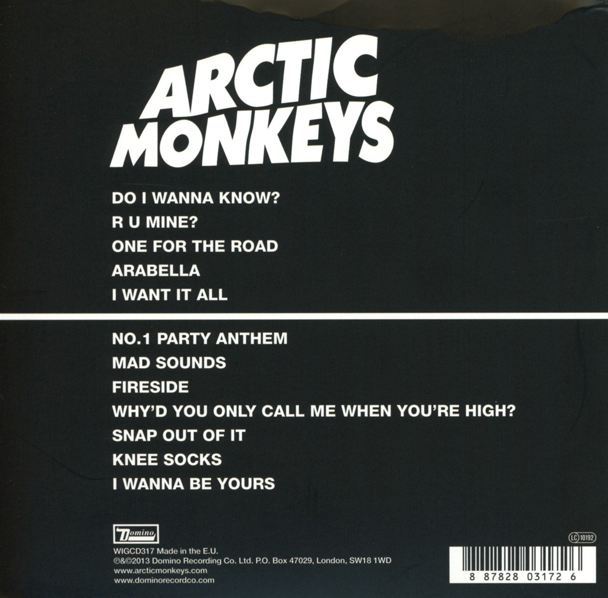
This is the album cover for American band Linkin Park's third studio album, "Minutes to Midnight" released in 2007. I like this album cover because there are minimal colours, and it also includes the logo (brand identity) of the band as the most prominent thing in the album cover. It also includes all of the band members, which is once again typical of  the Indie-rock genre. Also included in the digipak was close up pictures of the band members, as well as the band's "Linkin Park" logo printed on the CD - I think I will include my chosen band's logo for the print on my CD, as the logo is unique and creates and solidifies brand identity. Included in the booklet for "Minutes to Midnight" are the lyrics for all the songs included in the album, this is something that I could possibly do for my album booklet.


For my digipak, I have come to the conclusion that the booklet, or whatever is included inside the digipak (not the CD), should include some picture or pictures of the band, either when they are practicing their songs or individually. To do this would be conforming to the Indie-rock genre, as many other artists of the same genre as my chosen band have done this with their digipak; it would also appeal to my target audience. For my final digipak, I feel that I should have a shot of all the band on the album cover - due to it being my chosen band's debut album, it is imperative that the audience is introduced to the entire band. I also feel that the shot of the album cover should include the location the band filmed the majority of their first video, in my case my final cut of "Stuey's Morris Isis", as this is where the audience would recognise the most. I believe that this would create a brand identity for the band, and make them instantly recognisable in the future. This would be coupled with the band's logo. 

Magazine Adverts:


This is the magazine advert for British singer Ed Sheeran's debut album "+". I like the style of this advert due to the simple layout we can see - there aren't a lot of images, colours or fonts on show, but the organisation of everything grabs the readers attention. At the top of the advert we see the name of the artist, "Ed Sheeran" in a white font, with an image of a paw print to the right of the text. For obvious reasons, this is included to tell the audience who the magazine advert is about. The image seen in the middle is the album cover for the album "+" being advertised - the reason for this is because the artist is promoting the album, and wants to alert the audience as to what the album looks like. At the bottom of the magazine advert, in the same white font used at the top, is the important information that the audience need to know so they can purchase the album - this is imperative for the magazine advert to work, as the whole purpose is to inform the audience of the availability of the album. This information doesn't necessarily need to be presented this way, but some info about the album must be included on the magazine advert. 


I like this magazine advert by the Kings of Leon, who are part of my chosen genre, due to the unique nature of the image seen in the middle of the advert. This unique image immediately grabs the readers attention, which is one of the main purposes of the magazine advert. The band's name is featured on the top of the magazine advert, in a white, sort of futuristic font. This font also appears throughout the magazine advert, and is most apparent at the bottom of the advert, where the advert includes the name of the album being advertised, "Only By The Night", with the names of the popular songs below, and in red font the statement that the album is "Out Now". Something like this would be good to include in my magazine advert, as I particularly like the layout of the information seen on the advert. 


This is a magazine advert for Coldplay's album "Viva La Vida". This includes the band's name on the top of the advert in a standard white font, with the rest of the text seen on the advert in the same white font, just a smaller size. The name of the album is located below the band's name, with "The New Album" situated below the album name - this informs the audience that the reason that Coldplay are advertising is because they have released a new album. An image of the entire band is seen in the middle of the advert, with the lead singer Chris Martin most prominent - this is due to the fact that he is the lead singer, and is most likely to be recognised by new audiences. At the bottom of the poster is the info that might attract audiences to the new album. "Violet Hill", "Viva La Vida" and "Lost" are the most popular songs released prior to the release of the full album, and because the audience are most likely to like those songs due to their popularity, they might purchase the album.


The image is incredibly important in the advert for the album, as this is what the audience are looking at. In my research into Arctic Monkeys album advert, they always included something relevant to the album cover, or they included a single image of the band/band member, but just enough to continue with brand identity. In my final magazine advert, I will include an image that is relevant to the digipak and the band, because the digipak contents of the digipak is what the band are trying to sell to the audience through this magazine advert. 

Creating My Digipak and Magazine Advert

During the construction stage of my rough cut and final versions of my digipak, I  plan on using a software called Photoshop, which I believe will enable me to create effective pieces to conform to the Indie genre, through images and text for example.


This particular tool will enable be to cut round an image and separate it from everything, allowing me to copy the cut-out image and paste it onto another image. This could be very useful for my digipak and magazine advert, as I may want the band against a different backdrop in different parts of the digipak and magazine advert. 


This tool on Photoshop will allow me to put text onto images. This will certainly be used throughout the digipak and magazine advert, as information such as "Not My Day" and "Featuring Stuey's Morris Isis" needs to be included. The tool will also allow me to choose what font and colour of font I want to use, and in this case I will select the "stencil" font, as that is the brand identity I want to create throughout my digipak and magazine advert. 

There are many other tools on Photoshop, such as changing the filter of the image, that I believe will enable me to complete work of a near industry standard in my digipak and magazine advert. 


Monday, 7 April 2014

Research for My Digipak - The Killers

Research For My Digipak

In my digipak I plan to include elements of the Indie genre that will conform and also appeal to my target audience - for example, many album covers and digipaks in the Indie genre are kept simple; this gives off the impression that the band is focused on the quality of music, and wants the audience to focus on the music too. Like I mentioned in another blog, using an iconic album cover style from a previous band as inspiration can also work in your favour, as the audience is automatically attracted to your digipak. Pink Floyd's "The Dark Side of the Moon" album artwork is considered one of the greatest of all time, so this simple approach could be used as inspiration for my digipak. However, this could backfire - the audience could feel that you are trying to imitate a successful band, rather than creating your own band image and identity. 

Pink Floyd's iconic album artwork for their album, "The Dark Side of the Moon"

For my digipak research, I have chosen to look at some digipaks that the famous Indie-rock band The Killers have released. I have chosen to research this particular band because they are very successful, creating a recognisable band image and identity, and also because they are in the same genre as my chosen band, so I could take inspiration from some of their digipaks.

The Killers

The Killers are an Indie-rock band formed in Las Vegas, 2001 by Brandon Flowers (Lead vocalist and keyboard) and Dave Keuning (backing vocals and guitar). Mark Stoermer (bass and backing vocals) and Ronnie Vannucci Jr. (drums, percussion and backing vocals) would join in 2002, forming the current lineup of the popular band. They have released four albums, "Hot Fuss" in 2004, "Sam's Town" in 2006, "Day & Age" in 2008, and most recently "Battle Born" in 2012.


Front Cover of "Hot Fuss", The Killers debut album
This is the front part of the album cover for "Hot Fuss", released in 2004 by The Killers. The band logo is situated in the middle of the cover in a white, unique font - straight away this grabs the audience's attention, as the band logo would not have been seen by audiences before its release, therefore creating a band identity from their debut album cover. The Arctic Monkeys' debut album created a similar band identity with the unique font of the band's name. The name of the album is then placed beneath "The Killers" in a contrasting plain red font. The red contrasts against the sky blue background - seen at the bottom of the cover are tall buildings. The camera angle of the photo makes the audience look up at the sky - this could signify the rise in which The Killers have undergone since penetrating the mainstream market, or it could symbolise that "the sky is the limit" for the band. The use of buildings, which looks like a block of flats, in this photos could also be telling the audience that anyone can do what The Killers have done, once again conforming to the Indie-genre's idea that the band are just normal people that perform music.

Back Cover of "Hot Fuss"

The back of album cover is in keeping with the front - the background of the blue sky, and the fonts and colour scheme also seen on the front. The song listing of the album is in a small white font in the top left hand corner. The reason as to why it is so small could be that the band are hinting to many more songs released from the band in the future, therefore leaving the audience wanting more. Seen at the bottom of the back cover is the specifications of the album, such as recording studios and the record label's details - these are always written in a small font, as the audience are not particularly interested in them, but they have to be included for lawful reasons. There is a white version of the logo that The Killers belong to, Lizard King/Vertigo Island, on the left of that writing - any of the audience would instantly recognise the record label that the band belong to. This is all part of The Killers creating a band identity, which is especially important when releasing their debut album, as the band carry on the brand identity created when releasing "Hot Fuss" onto their further releases in the future.


Front Cover for The Killer's second album, "Sam's Town"

The most prominent thing on the front cover of "Sam's Town" is once again the band name - the font and size is exactly the same as their previous release "Hot Fuss", albeit in a different colour, therefore The Killers are being consistent with their brand identity. Once again, the name of the album is placed below "The Killers", but this time it is a different font and font colour - the name of the album doesn't have to be as consistent as the band logo. This is because the band's name always stays the same, whereas the albums always differ. Also on the front cover of the album is a picture of a mountain goat, a woman with a banner titled "miss" around her, and what looks like a worn down trailer behind them, all presented through a long shot. The woman may be "Sam", the person that The Killers have named the album after - these pictures in the front cover give the audience an idea of why the band called the album "Sam's Town".

Back Cover of "Sam's Town", released in 2006

This is the back cover, and the audience can see a black and white filter, also apparent on the front of the album, medium-shot of the entire band. The reason as to why the band are shot this, which is very similar to the images seen on the front of the album cover, is because it conveys to the audience that The Killers are part of "Sam's Town". Seen at the bottom of the cover is the song listings - these are displayed to us in small red and white fonts, with the red colour similar to that shown to display the name "Sam's Town" on the front cover. Below the song listings are the usual specifications of the albums, along with the record label's logo in white. Everything seen in this album cover conforms to the Indie-rock genre my chosen band is in, and I could use similar ideas in my digipak.


Seen here is the CD for The Killers sophomore album, "Sam's Town". The image on the CD is a black and white, keeping consistency with the rest of the digipak, close up shot of a mountain goat, which could be the one seen on the front cover of the album. Further specifications are seen around the CD, written in white font - it could be written in white font because the audience aren't interested in the specifications, but they have to be included for lawful reasons. The white font blends into the black and white background, therefore making it hard to read.


Front Cover of the album "Day & Age"

This is the front cover of the album "Day & Age", the third album from The Killers, released in 2008. In this album, The Killers moved away from their Indie-rock roots and explored the Dance-rock genre. This change in style can be seen from the colours used on the front cover - they are vibrant colours of purple, blue and yellow, which represent those shown from dance artists. When comparing the colours used in this album cover with those in previous releases, you straight away get the feeling that the band are attempting to change their style. I say this because in their previous two albums, The Killers used grungy colours that would represent the Indie genre, and vibrant colours like purple wouldn't be seen. However, the layout of the front cover has been kept the same in this album as it was in the previous two - "The Killers" band logo is once again situated in the centre, in a shade of purple (which proves the change in musical style, as this colour wouldn't usually be seen in Indie digipaks), with the same of the album, "Day & Age" in a smaller white font underneath it. Even with the change in musical styles, it is imperative that The Killers don't change their band identity - their logo is instantly recognisable to their fans and audiences alike, all through the consistent brand identity created in their earlier albums.


Back Cover for the album "Day & Age"
The back of the album cover is once again consistent with the front, with the vibrant colours seen on the front also apparent on the back. The same white font used on the front cover for the album title, "Day & Age", is also used to list the songs that can be heard on the album -this is seen throughout all The Killers albums, with their previous efforts "Hot Fuss" and "Sam's Town" doing the same thing. At the bottom of the sleeve are the specifications, written in small white font, and the logo of the record label, Island Records, is also seen.


CD Print for "Day & Age", released in 2008


This is the CD of the digipak from The Killers third studio album, "Day & Age". The print of the CD is that shown on the front and back cover of the album art, which was a mosaic pattern in different shades of blue and purple, to represent their change in musical style. This is apparent on the CD and, much like their previous release "Sam's Town", is in keeping with the theme of the digipak. This CD print goes with the rest of the digipak, making the audience recognise who the CD belongs to, and what album the CD is from. The light purple and blue mosaic is printed on top of a black background, which makes the colours even more prominent. Seen going around the rim are the specifications, similar to those seen on the back of the album cover. They are written in a very small white font, almost unreadable, and support the Island Records logo. For my digipak I will include a print on the CD that is relevant with the rest of the digipak, as demonstrated by The Killers in "Hot Fuss", "Sam's Town" and "Day & Age".

The Killers most recent release, "Battle Born"

After a four year hiatus, since their change in musical style in 2008's release "Day & Age", The Killers returned in 2012 with their most recent and fourth studio album, "Battle Born". "The Killers" famous logo, like all their other releases, is the most prominent thing on the album cover, as it is centered in the middle of the cover - even after four years without an album, The Killers still keep their brand identity with the styling of their logo on this album. "Battle Born", the name of the album, is once again located directly underneath the band's logo. "Battle Born" is stylised in a bold, black font - the "e" in Battle Born is presented a lightening bolt; this could signify the return to the band's Indie-rock roots, as the delivery of the album title on the front cover is striking. Image shown further solidifies the claim that The Killers are returning to their Indie-rock roots demonstrated in their first two albums. There is a long shot of a highway, with a car looking like it is going head-first into a horse - the horse could be a metaphor for The Killers, and could signify that they are ready for anything that comes their way, hence the relevance of the title "Battle Born". The dull setting of the picture could possibly signify the dark road that the band went on during their hiatus, but now they are ready for anything.

Back of the album cover

Seen on the back of the album cover is the track list of "Battle Born". The songs listed are seen in red, but in the same font that was used on the front cover for the album title - as you can see, The Killers have done this with every studio album they have released, therefore being consistent and in keeping with their brand identity as a band. The image seen behind the track list is set in the same area that the image on the front was set in. At the bottom of the back of the album cover are the specifications, with the record label's, Island Records, logo all in red. In my digipak, I should use the same font for my track list on the back and my album title on the front, in order to keep a consistent brand identity - this is especially important with a debut album, as it sets the standards for later albums.


CD Print for The Killers album, "Battle Born"
This is the CD print for The Killers fourth studio album, "Battle Born". A constant theme throughout The Killers' discography, the CD print is something relevant with the rest of the digipak. The print is most likely an extreme close up shot of the headlight from the car in the album front cover. The top half of the CD has "The Killers" written in capitals letters in a dark red font, making it almost unreadable against the image. The bottom half has the album title "Battle Born", in the same font, size and colour. This makes the audience recognise the physical CD straight away, once again solidifying The Killers brand image. Written around the rim, in white font, are the same specifications seen on the back of the album cover, along with the record label's logo.


I have learnt that, in order to keep brand identity consistent, I must include relevant pictures in my digipak - an example of this is the CD image of "Sam's Town", as the goat seen on the CD print also appears on the front of the album cover. Also, I will use the same fonts apparent on the front of my album cover to present my track list on the back. I believe that if I include these things in my digipak, I will create a consistent brand identity for my chosen band.

Monday, 31 March 2014

Research for My Digipak and Magazine Advert - Arctic Monkeys

Research for My Digipak

In this post I will discuss the processes that took place in the creation of my digipak, which includes my CD album sleeve, booklet inside the CD case, and the CD itself. I will also analyse a magazine advert that the Arctic Monkeys have released. In my digipak, I plan on creating a brand identity that will differentiate the band I have chosen to other bands in the music industry. For my research I studied and gathered information on two bands that have the same style and genre as my chosen band, and included albums that they have released, and also the entire digipak that was included in that album. I will use these as inspiration for my digipak - I could also take inspiration from iconic album covers over the years, such as the famous album cover from The Beatles in which they walked across a zebra crossing. 

Something as iconic as this could be used as inspiration for my digipak

Arctic Monkeys

The Arctic Monkeys are an indie-rock band, similar to my chosen band, from Sheffield in the UK. The band consists of four members, Alex Turner, who is the lead singer and guitarist; Jamie Cook, who is also the lead guitarist; Nick O'Malley, who is the bassist and backing vocals and Matt Helders, who is the drummer and does backing vocals. The Arctic Monkeys have released five studio albums, with their debut album, "Whatever People Say I Am, That's What I'm Not", released in 2006. All five of their albums have reached number one in the UK charts, making them one of the most successful bands in British history. Their debut album became the fastest selling debut album in UK history, and currently still holds that record. 

Arctic Monkeys' Debut Album. They kept the same font throughout the album cover and CD, therefore keeping their brand identity.


Album cover for The Vaccines' "Come of Age"
The album cover shown above is typical of the indie-rock genre of music, with a band called The Vaccines creating a very similar styled album cover for their album "Come of Age". A single person is seen on the album cover, with a close up camera shot being used to see all of the person's facial features. As a lot of the lyrics in this genre consist of going on "nights out" (my chosen song is about this as well), and I believe that these album covers are used to demonstrate the effects of partying; both people on the album covers look unwell. This sort of style of album cover could be a source of inspiration for my digipak, however I am not likely to do a similar digipak than those seen above.


The Arctic Monkeys have released four albums after the release of their debut album, and their album covers have changed styles. Their second album, "Favourite Worst Nightmare", was released in 2007 to similar commercial success and critical acclaim as their debut. The Arctic Monkeys' style of album cover changed significantly. I believe that they are trying to convey a house party - the songs in the album are very similar to that of the first, so I believe that in terms of musical style they were still the same as they were in their previous album. The reason I believe that is because the setting in which this cartoon-styled picture is taken could be interpreted as student flats. The target audience for Arctic Monkeys songs are around 16+, so the album covers setting in a student flat area makes sense in my opinion.

Other Arctic Monkeys albums include, "Humbug", "Suck it and See" and their most recent release, "AM".

The third album from Arctic Monkeys
"Humbug"
The digipack for the third release from the Arctic Monkeys, "Humbug", returns to a similar style that was shown in the first album. The three people in the album cover are shown to be smoking in what looks like an elevator, or a corridor in an apartment. The reason that this returns to a similar style is because the album cover appeals to its target audience, more than what was seen in their previous effort, "Favourite Worst Nightmare". The logo of the Arctic Monkeys is apparent once again on the album cover, in a similar font than what was seen in their previous two albums. The filter on the image gives the album cover a "vintage" look, which is seen on many albums present in the indie genre. This keeps the brand image of the band, because if anyone sees a similar font, they assume that it is the Arctic Monkeys. "Humbug" once again was released to the same commercial success as the previous two albums, making the Arctic Monkeys have three consecutive number ones in the UK.


The back of the album cover


The back cover of the album features the same font that is apparent on the front of the album cover, once again conforming to their brand identity. The listings of the songs featured in the album are seen in a plain black font - similar to that of the album name above the band logo. This creates consistency throughout the digipack for the audience. The contents of the back looks like it is written on a piece of paper - this is something I plan on doing in my digipack. The reason for this is because many of the artists plan and write their songs on pieces of paper like this, and it gives off the effect to the audience that they are a band of the Indie genre.


CD of the Album

This is the picture that features of the physical CD of the digipak. On the CD, it is important that the bands logo, or at least the name of the album, features on it, as this differentiates themselves from normal CDs. The Arctic Monkeys do this by imprinting their initials, "AM", on what looks like a pie. This unique CD stands out from the rest of them, once again solidifying their brand identity. The reason for the pie image could represent the normality of the band - they aren't like pop stars and enjoy the simple things in life, which is typical of the indie genre.


The fourth album from Arctic Monkeys,
"Suck it and See"

This is the album artwork for the Arctic Monkeys fourth official album, and fourth consecutive number one, titled "Suck It and See". The band decided to go for a very minimalist approach, with the only things present on the artwork their band name, once again keeping the brand identity, and the name of the album written in capital letters in plain black font. The background colour of the album cover is beige/cream. The reason as to why the Arctic Monkeys have done this might be because they want to give off the impression that they only want to focus on their music, and not the look of the band. This is popular in the Indie-genre, as a minimalist approach is used to differentiate themselves from being placed in the Pop category. Despite the simplistic presentation of the album cover, the band name has to be included on the front as this tells the audience who the album was made by - if they don't do this the audience wouldn't be able to tell who the artist was, due to the fact that they haven't got a lot of information to deduce who made it thanks to the simplicity of it.


The back of the album cover
This is the back cover of "Suck It and See". As with all their other albums, the band name takes up most of the space, along with the songs featured on the back. The font and colour of the words present throughout the album cover all stay the same, in order to create consistency with the image that the band are trying to create. Also featured on the back, once again in black, is the record label's logo the band belong to - this is featured on the back in a vast majority of album covers, as after all the record label they belong to are the ones that actually release the music to the audience. The Arctic Monkeys' record label is Domino.


The inside of the digipak


This is the contents of the digipack; it features a picture of the entire band, using a long shot. The location that the band are in seems relaxing, and this might be the persona that the Arctic Monkeys are trying to give off to their audience - that they are just four normal guys and do normal things. This picture that features in the digipak could also be used as a small poster for their fans who purchased hard copies of the album.


This is the CD for the album. There only image seen here is the Arctic Monkeys band logo featured on the CD, with the record label Domino at the bottom. This is the same style that is featured on the front and back of the CD cover, solidifying their consistent image of the band.


This is the front album cover of the Arctic Monkeys fifth, and most recent release, "AM". The title of the album doesn't feature on the front of the album, however once again the bands logo is in the top right hand corner, identical to their previous release, "Suck It and See". The main colours that feature are black and white, once again in-keeping with that simplistic approach shown in their previous albums, and also what is shown in the Indie genre generally. The image in the middle is a sound wave, and most probably is the sound wave created from one of their songs - this proves once again that the band are heavily focused on their music rather than their image, which is typical of their genre.


This is what the back of the Arctic Monkeys album cover looks like. The colours and fonts shown are all the same, with the band's logo taking up a third of the back.The name of the songs are written in a white and the same font that is seen in "Suck It and See". There is a thick white line that runs through the middle, which joins with the front cover of the album. The image in its full could be a sound wave in the form of a woman's bra, possibly relating to "nights out", which is a popular topic throughout all the Arctic Monkeys songs. The record label's logo, Domino, is also featured at the bottom of the back, along with other information and the bar-code.


The CD of the "AM" digipak is the same as the front cover of the album, with the white sound wave in front of the black background. This keeps the current image of the band consistent with the rest of the digipak.


For my finished digipak, I could use a simplistic approach similar to the Arctic Monkeys, "AM" and "Suck It and See". However, my band aren't established enough to use that approach when creating a digipak, so I will take inspiration from the Arctic Monkeys in the sense that they were consistent with their brand image, but I will most likely not take inspiration from their simple design of their albums. However, out of all the Arctic Monkeys albums discussed in this post, I am most likely to take inspiration from "Whatever People Say I am, That's What I'm Not" and "Humbug". I am more likely to be inspired by these albums because they conform heavily to the Indie genre, therefore I will be appealing to my chosen bands target audience.


Magazine Adverts/Posters for Arctic Monkeys


Magazine Adverts for the Arctic Monkeys latest album release, "AM"

This is the poster that would have been included in the promotional campaign for the Arctic Monkeys fifth studio album, "AM". The poster on the left is a portrait picture of the album's artwork - this makes the audience instantly recognise who the poster is from, as most likely fans have already seen the artwork for "AM". At the top of the poster is the band's name, "Arctic Monkeys", written in their signature white font - this keeps the brand identity of the band, and if the audience didn't recognise the image of the poster, they will certainly recognise the band logo. At the bottom of the poster is the information regarding the album release date - written in white font are the words "NEW ALBUM", telling the audience about their new release; "AM" is a bigger font, alerting the audience to their new album's name; the release date, "09.10.13", informing the audience as to when they can purchase the new album. Also seen at the bottom is the record label of the band, which is Domino. All the information seen at the bottom is imperative to making a successful poster - if this information isn't included, the audience is kept guessing as to what the poster is about, rather than being alerted to a new album from the band. The poster has two colours, with a black background, with the images and text all in white.

The poster on the right, another "AM" promotional poster, is the most likely of the two to be seen in a magazine such as NME. On the poster/magazine advert there is a black and white image of the band's lead guitarist and vocalist Alex Turner, performing one of the band's songs at a venue or concert. This poster is more likely to appeal to the audience, hence why it probably featured in a magazine, because it shows the band performing, and their is a lot more action going on that the poster next to it. The low angle shot of Alex Turner gives the gives the audience a sense that they are there watching them perform, meaning that it could also be a POV shot - the audience are seen in the background looking up at the band and Alex Turner, which backs up my opinion of the shot possibly being point of view. Much like the poster on the left, there is the "Arctic Monkeys" logo above Alex Turner - once again, their logo is their brand identity, and will be included in every marketing campaign that the band are involved in, as their logo is the most recognisable thing to the audience. Seen at the bottom going from left to right is the same information included on the other poster: "NEW ALBUM", "AM" and the release date, "09.10.13". Also at the bottom, in the right hand corner, is the Domino logo which is the record label that they band belong to. All text is seen in white, contrasting against the black and white image in the background.

I think that the poster on the right of the two would be good to use as inspiration for my magazine poster/advert, as it includes the most famous band member, the information surrounding the album release, and the band's logo, being consistent with their brand identity.

The posters for the Arctic Monkeys previous releases can be seen below:


As you can see, all five of the Arctic Monkeys posters promoting their albums are set out in a similar, yet different enough to not be considered the same, style - this conforms to their brand identity, as any poster set out in this way is automatically liked to the Arctic Monkeys posters.


Friday, 21 March 2014

Rough Cut For My Music Video

Rough Cut


This is the rough cut for my music video - it is the general idea of what my final music video will look like. We have received feedback from the class, and the general consensus was that the editing needs to be faster and more in time with the beat of the song. Positives were the continuity of the drummer close up, and the band jumping up and when they land they are in different positions. I feel that I can complete all the things with which will make my music video a better final product.

The rough cut also demonstrated my ability to edit my footage so the lyrics of the song matched the mouth movements of the lead singer - also known as lip syncing. I feel that this went particularly well, as the lip syncing was in perfect time with the song. All real media music video products must show this, as without it the video doesn't look professional. 


Thursday, 20 March 2014

Shot List

Shot List for My Music Video

Throughout my music video, there are many shots, editing techniques and effects; these all add a difference from the footage originally filmed and the final product.

Extreme Close Up

In my music video, I plan to make good use of the extreme close up when there are long instrumentals. The reason as to why I like the idea of including many extreme close ups in my music video is down to the fact that it gives the audience unique perspective. The extreme close up shot that I think would work quite well is something similar to the image that can be seen below. I plan on using the extreme close ups a lot, but not littering my final product with them, as it could become boring to the audience if the shot is overused in the video.


Low Angle Shot

This particular shot is another that I plan to use in my music video, in order to keep the video fresh with different types of camera angles and shots. The low angle shot is primarily used to connotate a dominant person or object. However, in my music video I plan on using this shot to give the audience a perspective that they wouldn't usually associate with an Indie music video, therefore adding variety to my final product.


High Angle Shot

This shot is used with similar effect to the low angle shot, as mentioned previously. This particular angle I believe will be useful in getting the entire band on screen, also providing an alternate angle to the standard medium shot used in most music video productions. Also, there is an opportunity for the lead singer to look up and sing to the camera, which could provide a good way to portray the song to the audience - something like this can be seen in music videos in the Indie genre.


Medium Shot

This particular shot is very common in all types of visual media products, whether it be in a film or a music video. This shot shows most of the individual's face and body, like the image seen below. I believe this will be effective in my music video as it helps introduce the band members to the audience - as the band are new on scene, it is important for the audience to get used to what each band member looks like, and a medium shot of each member will do this, so I plan to include this shot in the final cut of my music video.


These are the most common, and in my opinion the most important, camera shots and angles that will feature in my music video. As I plan to shoot my music video in primarily one location, I think it is important to have a wide variety of shots in order to be in keeping with the fast tempo of the song. 


Friday, 7 March 2014

Filming Schedule

Filming Schedule for My Music Video


The filming schedule that I agreed with the participators (other members of the band) was that filming sessions will take place on a Sunday, as that was the day that all the members of the bands were available to help me film.

Sunday January 12th 2014 

I had a football match in the morning, so we had to film in the afternoon. I contacted the members of the band and told them that, if it was ok, they should arrive at my house for 2pm, as that was the time everyone was able to film. The reason as to why I told the band members to arrive at my house was because we were filming in the primary location for my music video, which was my garage.

On this day, the plan was to complete the rough cut for my music video. This included the performance of the majority of the song, including many camera shots and angles.

This day on my filming schedule went to plan, as I completed all the filming needed for my rough cut.

Sunday January 26th 2014

I the football match that I was supposed to have in the morning got cancelled due to the weather, so I alerted the band to come to my house at an earlier time of 1pm, in order for us to complete some more filming. The location once again was the garage, so I told the band members to come to my house, dressed in the same clothes that they wore to the previous film shoot.

The plan for today was to perform the entire song in the garage, so I had different locations in which the band performed the song in. Due to the audience feedback, it was necessary to do this. 

This day of filming also went to plan, as I got the footage needed to get closer to the finishing of my final product.

Sunday 23rd February 2014

I wasn't able to gather the band together for nearly a month after the last film shoot, so this was the next time I was able to film. Football was cancelled once again, so I told the band to meet at my house, wearing the same clothes, so we could conclude the filming in this location for my music video.

The plan for today was to finish all the garage scenes, and that included performing the entire song, and various other shots and angles. Today's filming included the shot where each member of the band swapped positions for the chorus. On this day, I also did a photo shoot for the front cover of my digipak.

This day of filming went to plan, as the last scenes of the band performing together were filmed.

Sunday 2nd March 2014

On this day in the filming schedule, I didn't need the entire band to be filmed, just the lead singer; because of this I didn't need to to contact the band, I just needed about 20 minutes of free time in the day to film, as I am the lead singer in the music video. 

The plan for today was to finish the final scenes for my music video - this included a close up and medium shot of the lead singer singing on the bed, as it linked with the lyrics. Another scene included a close up and medium shot of the lead singer lying in the back of a taxi, also linking with the lyrics. 

This day of filming was successful due to the fact that I didn't have to rely on anyone else, I just needed to free up 20 minutes of the day in order to finish the filming. This was the final filming session for my music video.


Costumes

Costumes Included in the Music Video

The costumes worn by the performers of my music video of the song, "Stuey's Morris Isis", will and have followed the codes and conventions of stereotypical Indie music videos.

The lead singer/guitarist wore a shirt with dark jeans and trainers (far right) - this is typical of the indie genre, with many performers such as The Arctic Monkeys.

The lead guitarist also wore a similar outfit, as shown in the picture (middle). As the guitarists perform very similarly, I thought it would make sense for them to wear similar outfits in order to fit in with the indie genre, as they are the two band members that the audience see the most.

In the indie genre, drummers don't stereotypically wear costumes similar to the other members of the band. This is because the drummers are at the back of the set, as demonstrated in my music video, and they don't also represent the image of the band like the guitarists and lead singers do. The drummer for my music video can be seen at the far left of the picture.

I feel that all costumes worn by the members of the band conformed to the indie genre of music, thus adding a realism to the music video. These photos were taken before we started filming.